

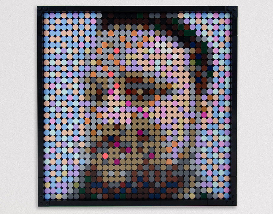
Lego Portraits
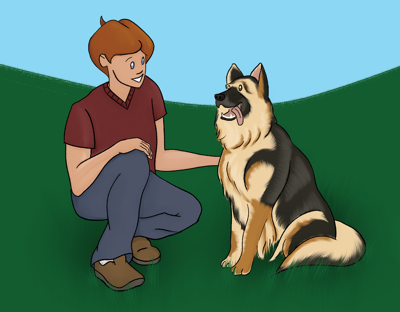
Joey's Buddy
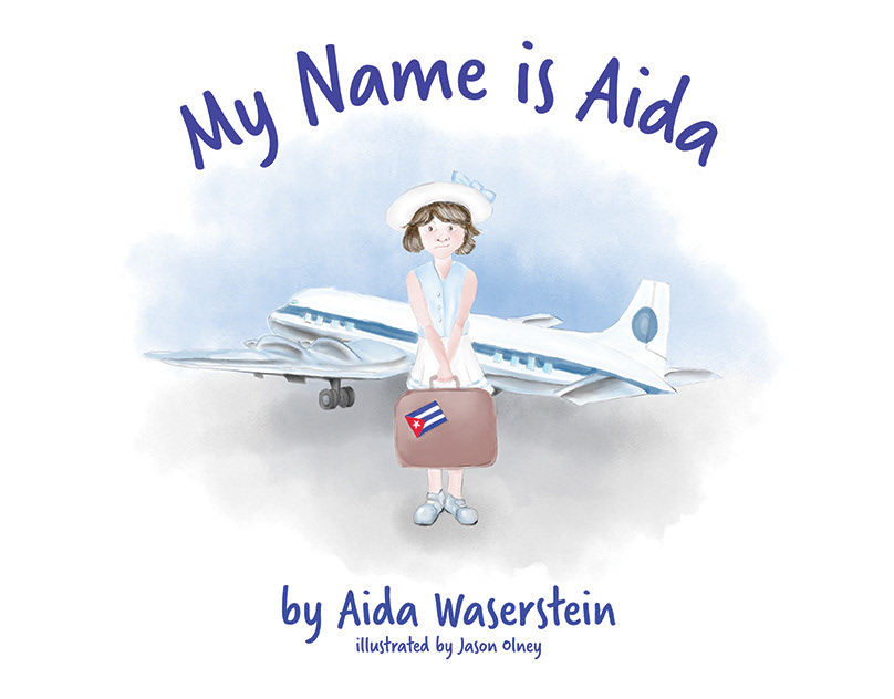
My Name is Aida

Noelle Picara Website Design
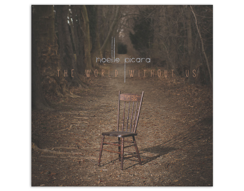
The World Without Us

My Own Frankenstein
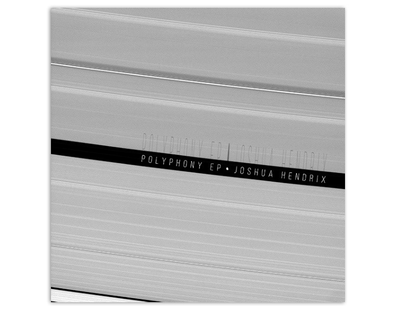
Polyphony EP
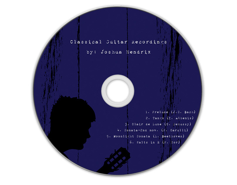
Classical Guitar Recordings
Diocese of Delaware Seal
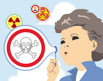
Crappy Clip Art A Day
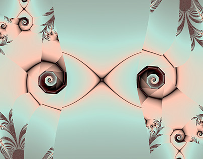
Fractal A Day
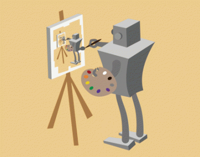
Robot A Day
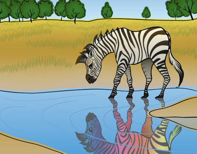
Animals

14 & Orange at FineStationery.com
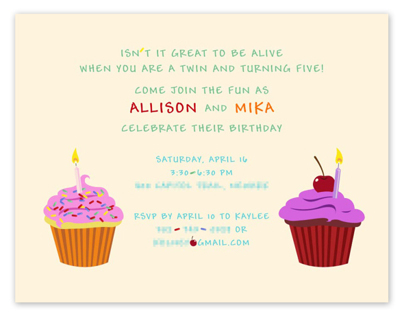
Stationery
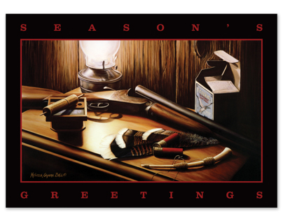
NWTF Holiday Cards at FineStationery.com

Mannington Floors Postcard
Noelle Picara Logo
Stephen Bach Portrait

Longwood Gardens

CareerPro Website
Mrs. Fields Retouch

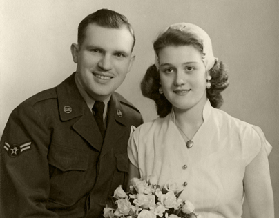
Flo and Harry Retouch
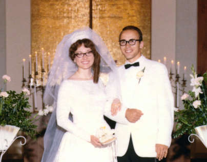
Janelle and Harvey Retouch
Val and Jack Retouch
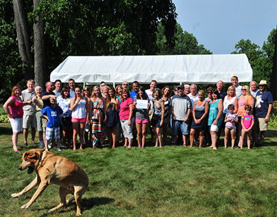
Family Reunion Retouch
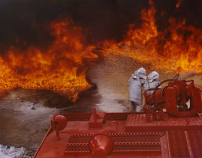
Firefighters Retouch